Designing Effective Web Banners sets the stage for creating visually stunning digital ads that grab attention and drive engagement. Dive into the world of web banner design and unleash your creativity!
Explore the key elements, design principles, and optimization techniques that will elevate your web banners to the next level, ensuring they stand out in the crowded online space.
Understanding Web Banner Design
Web banners play a crucial role in online advertising as they are the first thing that catches the user’s attention when they visit a website. They serve as a visual representation of a brand or product and can significantly impact user engagement and click-through rates.
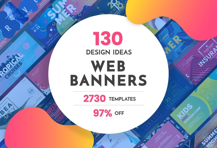
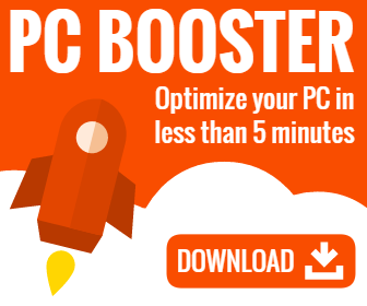
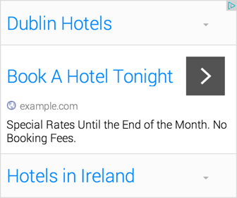
Effective web banner designs are those that are visually appealing, relevant to the target audience, and convey the message quickly and clearly. Here are some examples of effective web banner designs:
Key Elements of Effective Web Banner Design
- Clear Call-to-Action: A strong and compelling call-to-action (CTA) is essential to prompt users to take the desired action, whether it’s making a purchase, signing up for a newsletter, or visiting a website.
- Eye-catching Visuals: High-quality images or graphics that are relevant to the product or service being advertised can grab the user’s attention and make the banner more engaging.
- Concise Copy: The text on the web banner should be concise, easy to read, and communicate the message effectively. Avoid overcrowding the banner with too much text.
- Brand Consistency: Ensure that the web banner design is consistent with the overall branding of the company to maintain brand recognition and trust among users.
- Responsive Design: With the increasing use of mobile devices, it’s crucial to design web banners that are responsive and optimized for different screen sizes.
Design Principles for Web Banners

When it comes to creating eye-catching web banners, there are a few key design principles to keep in mind. From choosing the right color scheme to selecting the perfect typography, every detail plays a crucial role in making your banner stand out.
Choosing the Right Color Scheme
Choosing the right color scheme for your web banner can make a huge difference in its overall impact. Consider the following tips:
- Stick to a maximum of three to four colors to avoid overwhelming your audience.
- Use colors that complement each other and create a visually appealing contrast.
- Consider the psychology of colors and how they can evoke different emotions in viewers.
Importance of Typography in Web Banner Design
Typography is more than just choosing a fancy font – it’s about conveying your message effectively. Here’s why typography matters:
- Choose a font that is easy to read and aligns with your brand’s aesthetic.
- Experiment with font sizes, styles, and spacing to create hierarchy and emphasis in your banner.
- Consider the readability of your text, especially on smaller screens, to ensure your message is clear.
Tips for Creating Visually Appealing Web Banners
Creating visually appealing web banners requires attention to detail and creativity. Here are some tips to help you design banners that pop:
- Keep it simple and avoid clutter – less is often more when it comes to banner design.
- Use high-quality images and graphics to enhance the visual appeal of your banner.
- Make sure your banner has a clear call-to-action that prompts users to engage with your content.
Call-to-Action (CTA) Optimization: Designing Effective Web Banners

When it comes to web banners, the Call-to-Action (CTA) is a crucial element that prompts users to take the desired action. A compelling CTA can significantly impact the click-through rates and overall effectiveness of a web banner.
Examples of Effective CTAs
- For a web banner promoting a limited-time offer: “Shop Now and Save 50%!”
- For a web banner encouraging sign-ups: “Join our exclusive community today!”
- For a web banner promoting a webinar: “Register now to secure your spot!”
Techniques for Optimizing CTAs, Designing Effective Web Banners
- Use action-oriented language: Encourage users to take immediate action with words like “Shop Now,” “Register Today,” or “Learn More.”
- Create a sense of urgency: Incorporate phrases like “Limited Time Offer” or “Ending Soon” to motivate users to act quickly.
- Keep it concise: Make sure the CTA is clear, concise, and easy to understand for quick decision-making.
- Use contrasting colors: Make the CTA button stand out by using a color that contrasts with the background of the web banner.
- Test different CTAs: A/B testing different CTAs can help determine which one resonates best with your target audience and drives higher click-through rates.
Responsive Design for Web Banners
Responsive design is crucial in creating web banners to ensure optimal viewing experience across different devices and screen sizes. With the increasing use of mobile devices, it is essential to design web banners that adapt seamlessly to various screen resolutions.
Best Practices for Mobile-Friendly Web Banners
- Keep text concise and legible: Use clear and easy-to-read fonts that are large enough to be visible on smaller screens.
- Optimize images for faster loading: Compress images without compromising quality to reduce load times on mobile devices.
- Use simple and clean designs: Avoid cluttered layouts and excessive elements that may overwhelm smaller screens.
Tips for Ensuring Web Banners Look Good on Different Screen Sizes
- Test across multiple devices: Check how your web banners appear on various smartphones, tablets, and desktops to ensure consistency.
- Utilize media queries: Implement responsive design techniques like CSS media queries to adjust banner size and layout based on screen dimensions.
- Prioritize CTA placement: Ensure that your call-to-action buttons are easily accessible and prominent on all screen sizes for better interaction.


