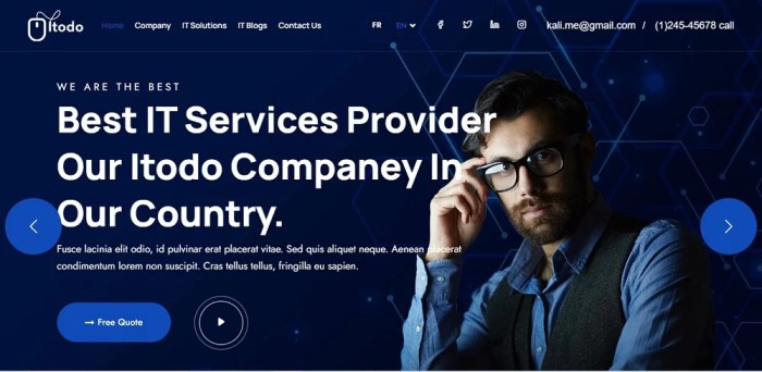
Website Design Ideas sets the stage for a creative journey into the world of modern web design, exploring color schemes, typography, navigation menus, and whitespace for an engaging user experience.
Website Design Ideas
When it comes to creating a visually appealing and user-friendly website, the color scheme plays a crucial role. Here are some trending color schemes for modern website designs:
- 1. Bold and Vibrant: Using bright and bold colors like neon green, electric blue, or hot pink to grab attention.
- 2. Dark Mode: Incorporating dark backgrounds with pops of bright colors for a sleek and modern look.
- 3. Monochromatic: Sticking to varying shades of a single color for a sophisticated and cohesive design.
- 4. Minimalistic Pastels: Soft pastel hues like blush pink, sky blue, and mint green for a calming and elegant feel.
Typography and Visual Appeal
Typography is more than just selecting a font; it can greatly enhance the visual appeal of a website. Different fonts, sizes, and spacing can evoke different emotions and convey the brand’s personality effectively.
Innovative Navigation Menus
Navigation menus are essential for guiding users through a website. Some innovative navigation menu ideas that improve user experience include:
- 1. Hamburger Menu: A compact and easily accessible menu that expands when clicked.
- 2. Sticky Navigation: Keeping the menu fixed at the top of the page for quick access while scrolling.
- 3. Mega Menu: A large dropdown menu that displays multiple options and categories at once.
- 4. Tabbed Navigation: Organizing content into tabs for easy browsing and switching between sections.
Importance of Whitespace
Whitespace, also known as negative space, plays a crucial role in creating a clean and organized website layout. It helps improve readability, focus on content, and create a sense of balance and sophistication.
Engaging Visual Elements: Website Design Ideas

Visual elements play a crucial role in capturing users’ attention on a website, making it visually appealing and engaging. High-quality images, videos, animations, and illustrations can significantly enhance the user experience and keep visitors on the site for longer.
High-Quality Images
High-quality images are essential for creating a visually stunning website. They help convey information, evoke emotions, and establish the brand’s identity. Whether it’s product photos, background images, or graphics, using sharp and well-composed images can draw users in and make the website more memorable.
Videos and Animations
Videos and animations are powerful tools for increasing user engagement. They can provide dynamic content, demonstrate products or services, tell stories, and entertain users. Incorporating videos and animations strategically can help convey complex information in an engaging way, keeping visitors interested and encouraging them to explore further.
Illustrations in Website Designs
Illustrations are a creative way to add personality and uniqueness to a website. They can be used to enhance storytelling, guide users through the content, or simply add visual interest. By incorporating custom illustrations that align with the brand’s style and message, a website can stand out and leave a lasting impression on visitors.
Parallax Scrolling
Parallax scrolling is a technique that creates an illusion of depth and movement by moving different layers of content at different speeds as the user scrolls. This interactive feature adds a sense of dynamism and interactivity to a website, making it more engaging and immersive for the users. When used thoughtfully, parallax scrolling can create a memorable and visually impactful experience for visitors.
Responsive Design
Responsive design is essential for ensuring a seamless user experience across all devices, including desktops, laptops, tablets, and smartphones. It allows websites to adapt to different screen sizes and resolutions, providing an optimal viewing experience for users.
Fluid Grids vs. Adaptive Design
When it comes to responsive design, there are two main approaches: fluid grids and adaptive design. Fluid grids use percentages to define the layout of a website, allowing it to adjust fluidly to different screen sizes. On the other hand, adaptive design uses fixed layout sizes based on specific breakpoints, which can lead to a more tailored experience for each screen size.
- Fluid Grids:
Fluid grids provide a more flexible and fluid layout that can adapt to any screen size seamlessly.
- Adaptive Design:
Adaptive design offers a more customized experience for different screen sizes by using fixed layout sizes at specific breakpoints.
Optimizing Images and Content for Mobile Devices
When optimizing images and content for mobile devices, it’s important to consider factors such as image size, resolution, and loading times. To ensure a fast and smooth experience on mobile, images should be compressed, and content should be concise and easy to read.
- Image Optimization:
Compress images to reduce file size and improve loading times on mobile devices.
- Content Optimization:
Keep content concise and prioritize important information to enhance readability on smaller screens.
Importance of Mobile-First Design
In today’s digital landscape, mobile-first design is crucial for creating user-friendly websites. With the increasing use of smartphones for browsing the internet, designing with a mobile-first approach ensures that websites are optimized for mobile devices first, then scaled up for larger screens.
- Mobile-First Approach:
Designing with a mobile-first approach prioritizes the mobile user experience, leading to better performance and usability across all devices.
Interactive Features

Interactive features on a website can greatly enhance user engagement and satisfaction. By incorporating elements like chatbots, quizzes, user feedback mechanisms, micro-interactions, and gamification, websites can create a more dynamic and enjoyable user experience.
Chatbots
Chatbots provide instant assistance to users, guiding them through the website and helping them find the information they need quickly. They simulate real conversations and offer personalized responses, making users feel more connected to the website.
Quizzes
Quizzes are a fun way to engage users and encourage them to interact with the content on the website. By providing quizzes related to the website’s topic, users can test their knowledge, learn new things, and stay entertained.
User Feedback Mechanisms
Integrating user feedback mechanisms such as surveys, polls, or comment sections allows users to share their opinions and suggestions. This not only makes users feel valued but also provides valuable insights for website improvement.
Micro-interactions
Micro-interactions are subtle animations or effects that respond to user actions, creating a more engaging and intuitive user interface. From hover effects to progress indicators, these small interactions enhance user experience and satisfaction.
Gamification, Website Design Ideas
By incorporating elements of gamification like points, badges, leaderboards, and rewards, websites can motivate users to interact more frequently and stay longer on the site. This can increase user retention and create a sense of achievement for users.


